From HANA Custom Query
In this step we will read data from SAP HANA custom query and cross this information with external data.
The steps required are:
Datasource setup
-
Open Power BI desktop, open a new Report.
-
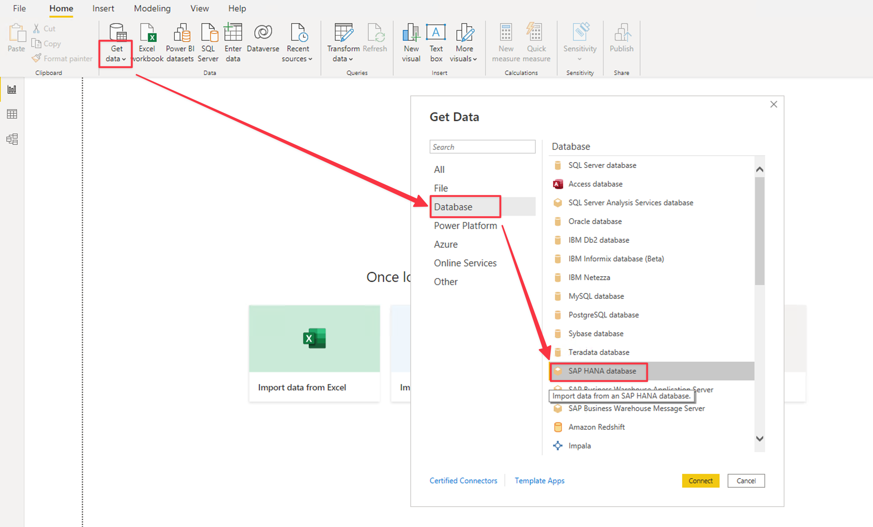
Click on the Get Data and select More. Select Database and pick SAP HANA database. Click Connect
-
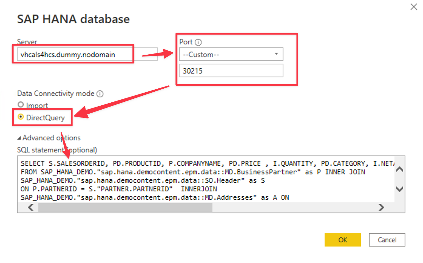
On the connection parameters set:
- Server = vhcals4hcs.dummy.nodomain
- Port = Custom and 30215
- Data connectivity = DirectQuery
- Open Advanced Options
- Paste the following query
SELECT S.SALESORDERID, PD.PRODUCTID, P.COMPANYNAME, PD.PRICE , I.QUANTITY, PD.CATEGORY, I.NETAMOUNT, S.BILLINGSTATUS, S.DELIVERYSTATUS , A.COUNTRY, A.LATITUDE, A.LONGITUDE, A.CITY FROM SAP_HANA_DEMO."sap.hana.democontent.epm.data::MD.BusinessPartner" as P INNER JOIN SAP_HANA_DEMO."sap.hana.democontent.epm.data::SO.Header" as S ON P.PARTNERID = S."PARTNER.PARTNERID" INNER JOIN SAP_HANA_DEMO."sap.hana.democontent.epm.data::MD.Addresses" as A ON A.ADDRESSID = P."ADDRESSES.ADDRESSID" INNER JOIN SAP_HANA_DEMO."sap.hana.democontent.epm.data::SO.Item" as I ON S.SALESORDERID = I.SALESORDERID INNER JOIN SAP_HANA_DEMO."sap.hana.democontent.epm.data::MD.Products" as PD ON PD.PRODUCTID = I."PRODUCT.PRODUCTID"- Click OK
-
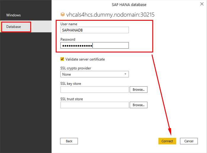
On the SAP HANA credentials set, click on the Database on the left panel and set:
- Username = SAPHANADB
- Password = The one set during SAP CAL deployment
- Uncheck Validate Server Certificate
- Click Connect
-
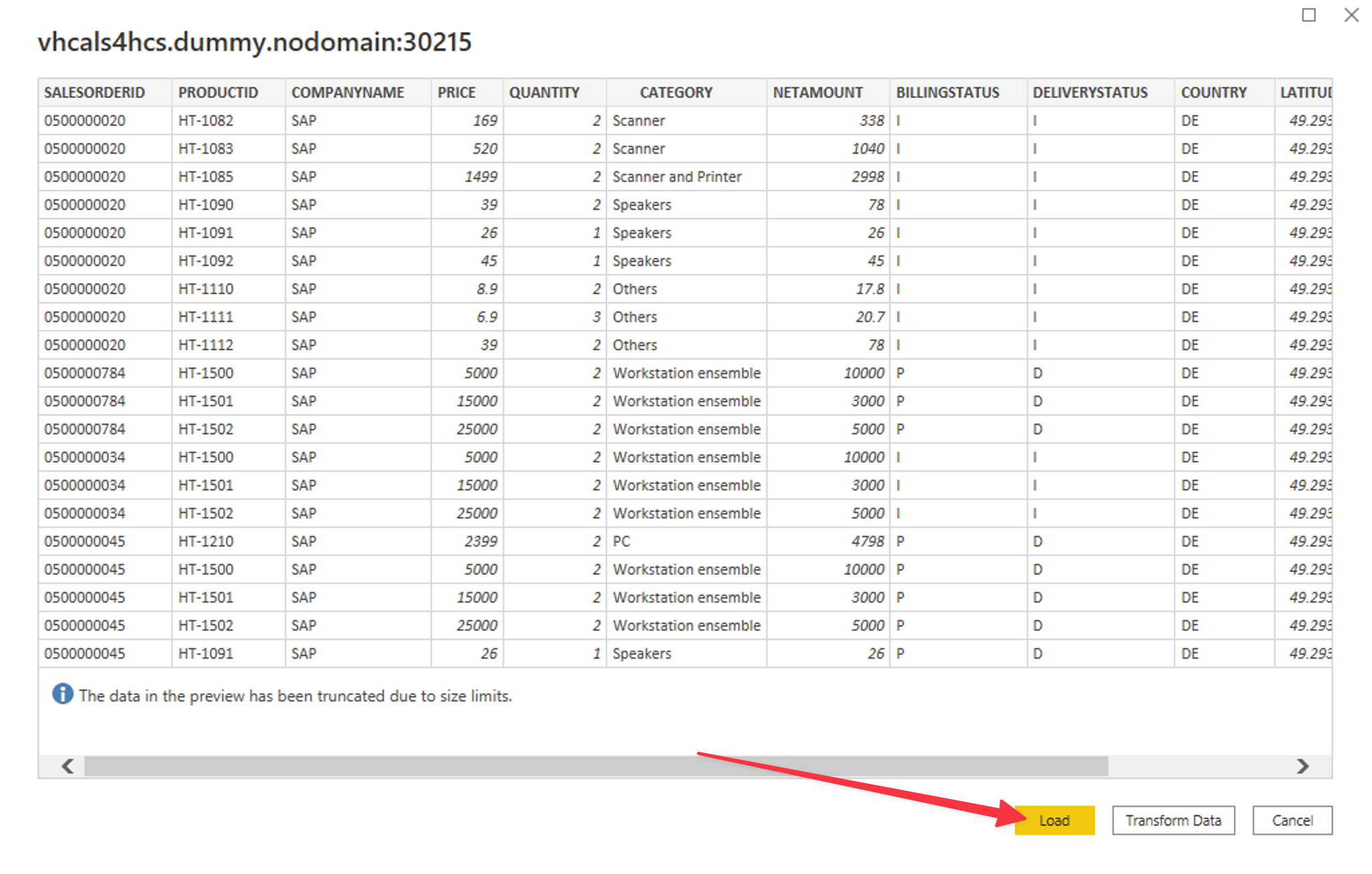
Once we provided a valid query, we won’t need to select the datasource. Feel free to explore the sample query data. Click Load
-
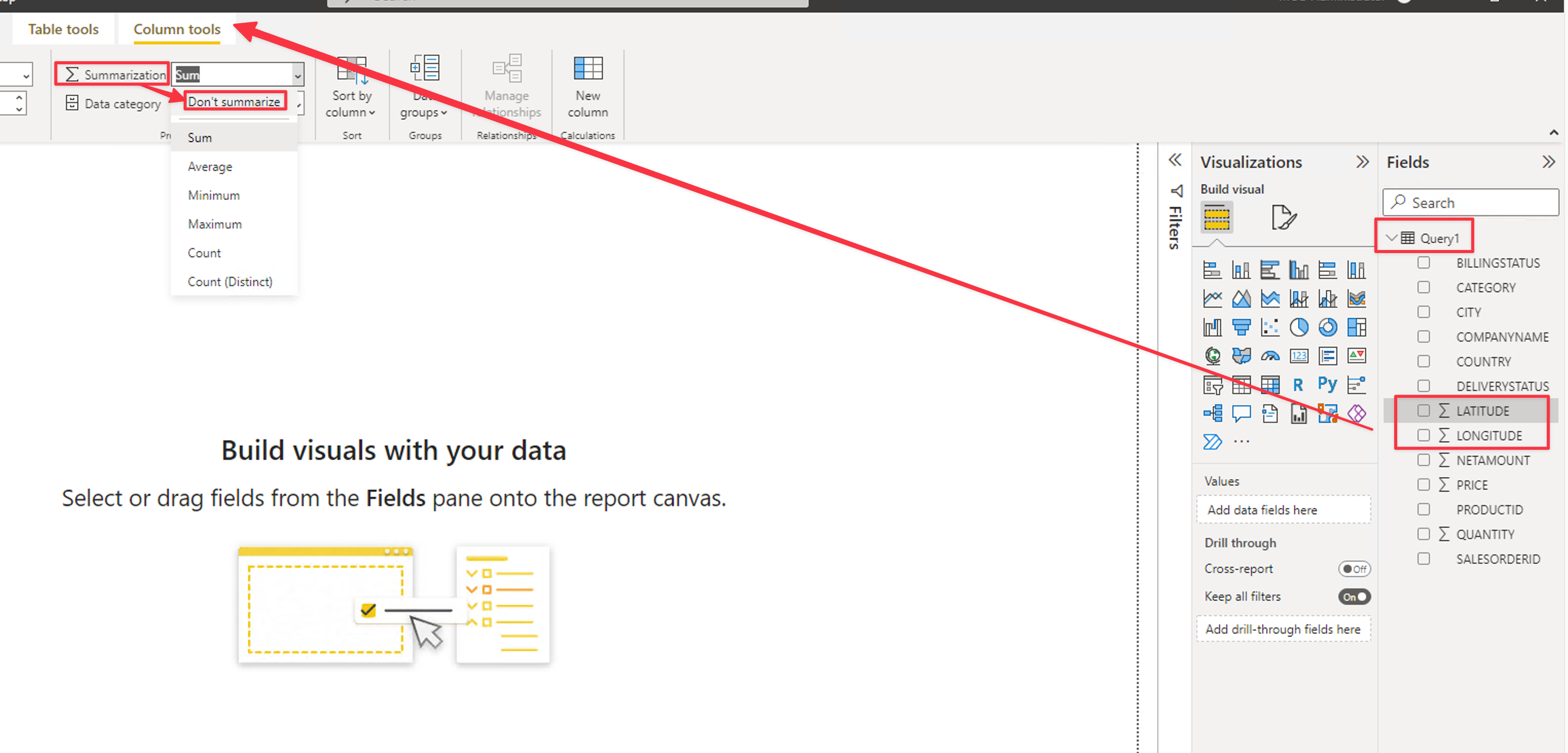
Before we start, let’s remove summarizations from LATITUDE and LONGITUDE fields. For both fields:
- Click on the field on the right panel
- Go to Column tools
- On Summarization pick Don’t Summarize
Now we are ready to start building the visualizations !
Building the visualizations
Let’s create some charts:
-
On the Visualizations Pane, click the Table. Drag the fields on the right side to the Visualization parameters as in the picture below:
- Columns = CATEGORY and NETAMOUNT
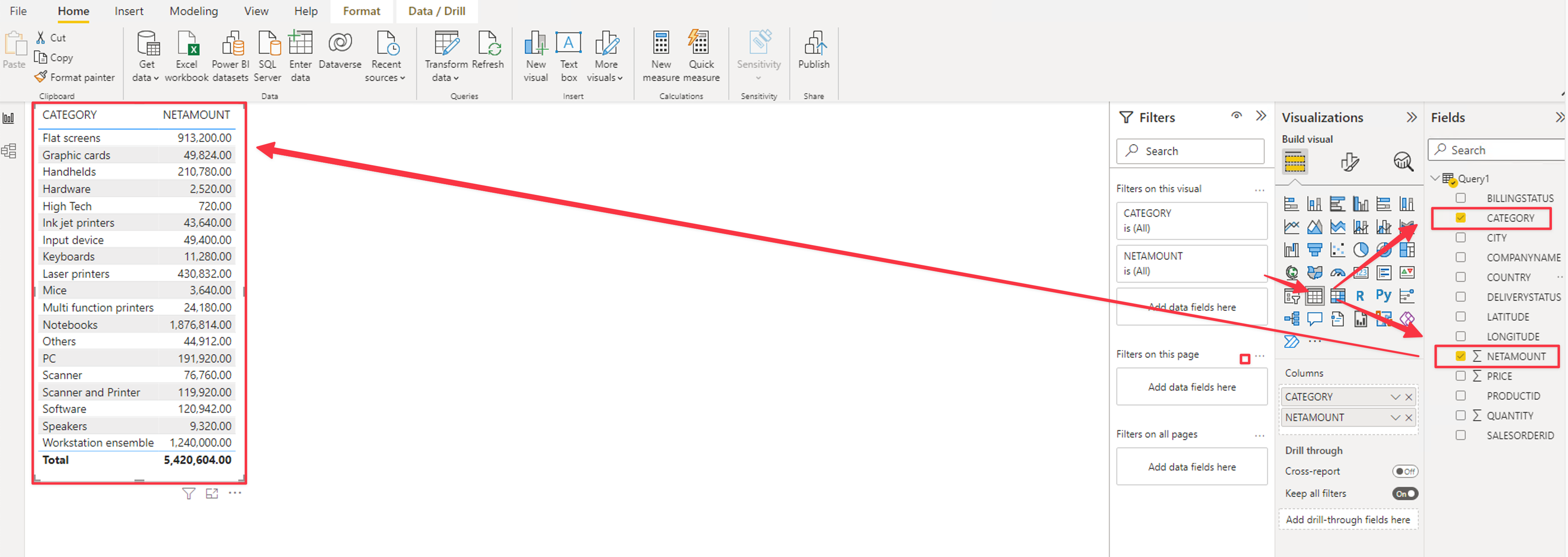
- Columns = CATEGORY and NETAMOUNT
-
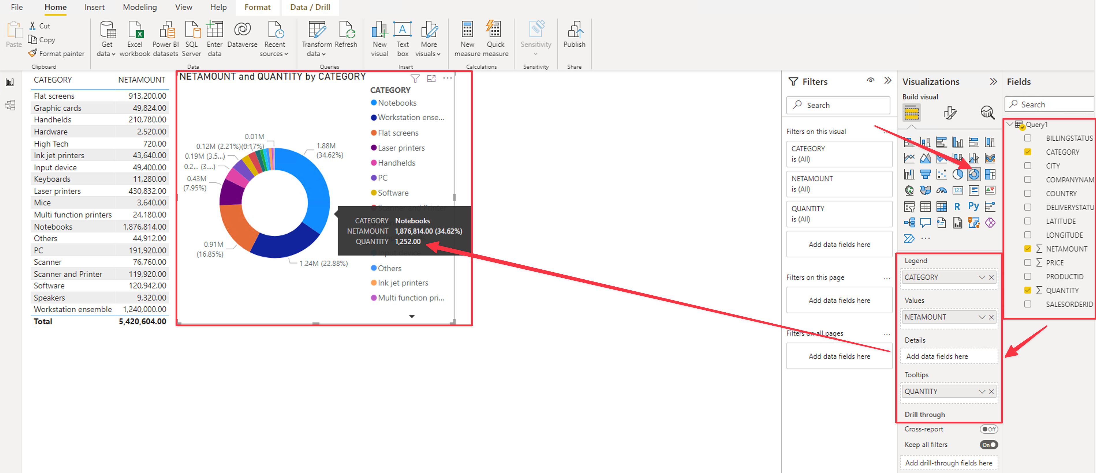
On the Visualizations Pane, click the Donut icon. Drag the fields on the right side to the Visualization parameters as in the picture below:
- Legend = CATEGORY
- Values = NETMAOUNT
- Tooltips = QUANTITY
-
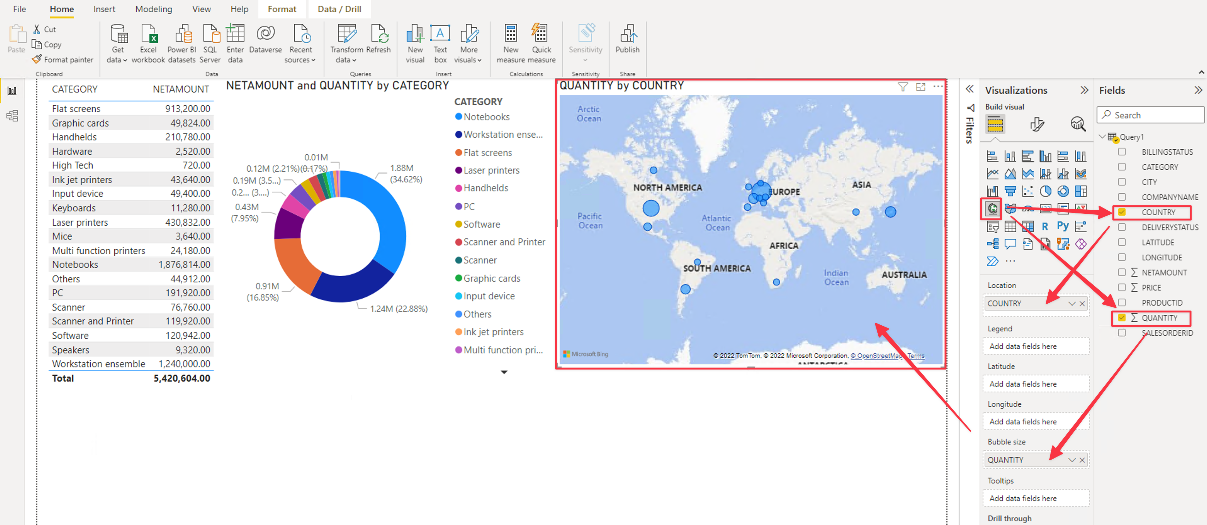
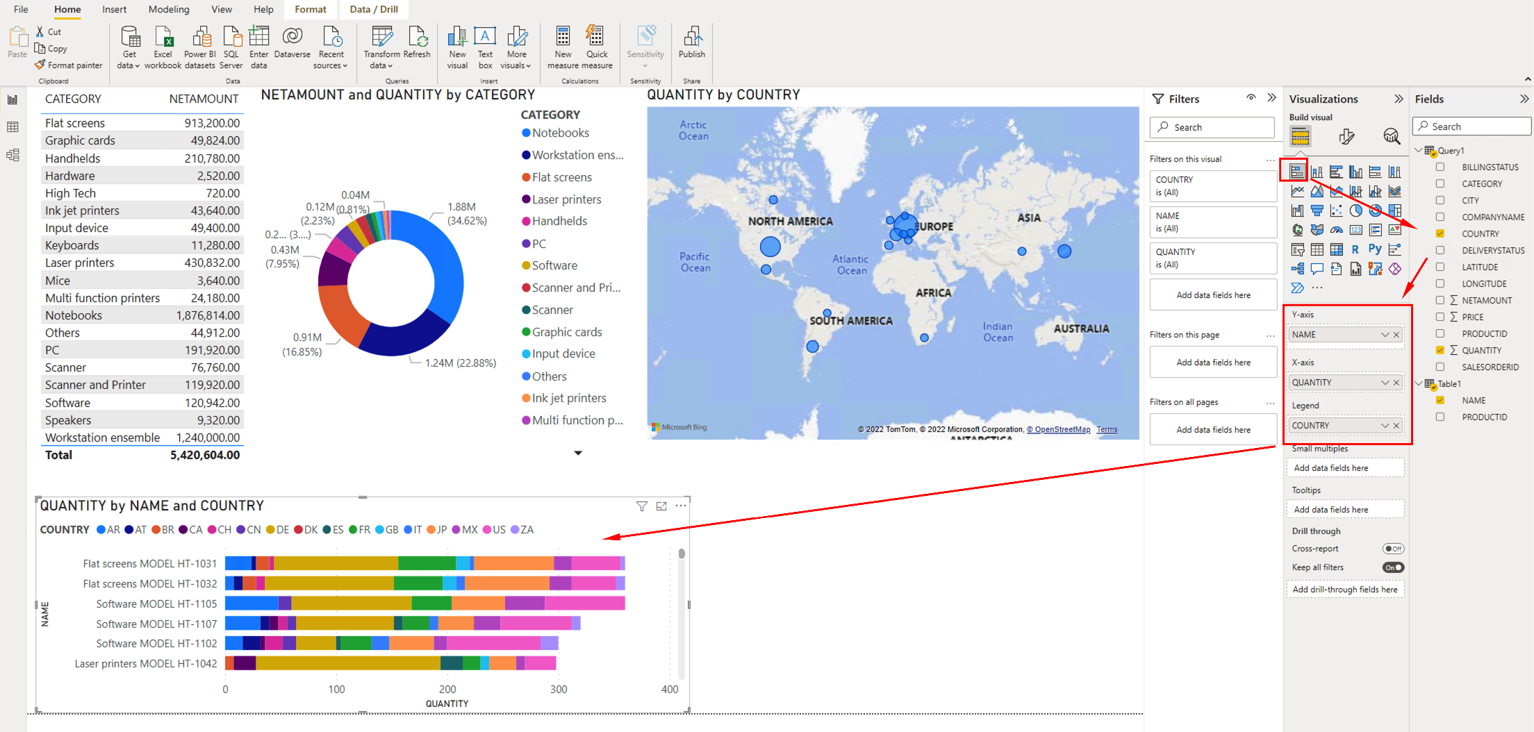
On the Visualizations Pane, click the Map. Drag the fields on the right side to the Visualization parameters as in the picture below:
- Location = COUNTRY
- Bubble Size = QUANTITY
-
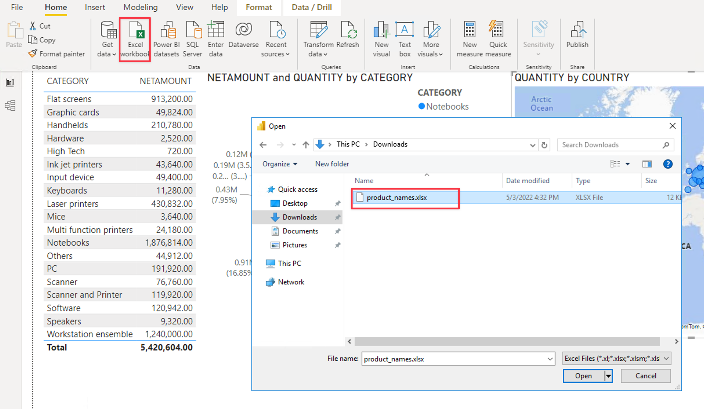
Now let’s import some external data. In this lab we will use an Excel file with the Product Names for each PRODUCTID field.
- On the Bastion Host, Download the Excel Sample File
- Select Excel workbook
- Open the downloaded product_names.xlsx file
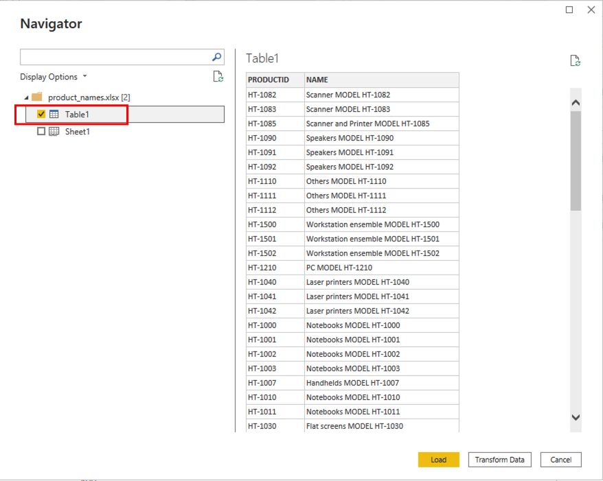
-
Pick the Table1 and click Load
-
If we try to select data from multiple sources, it will return an error, because we didn’t create a relationship between the two.
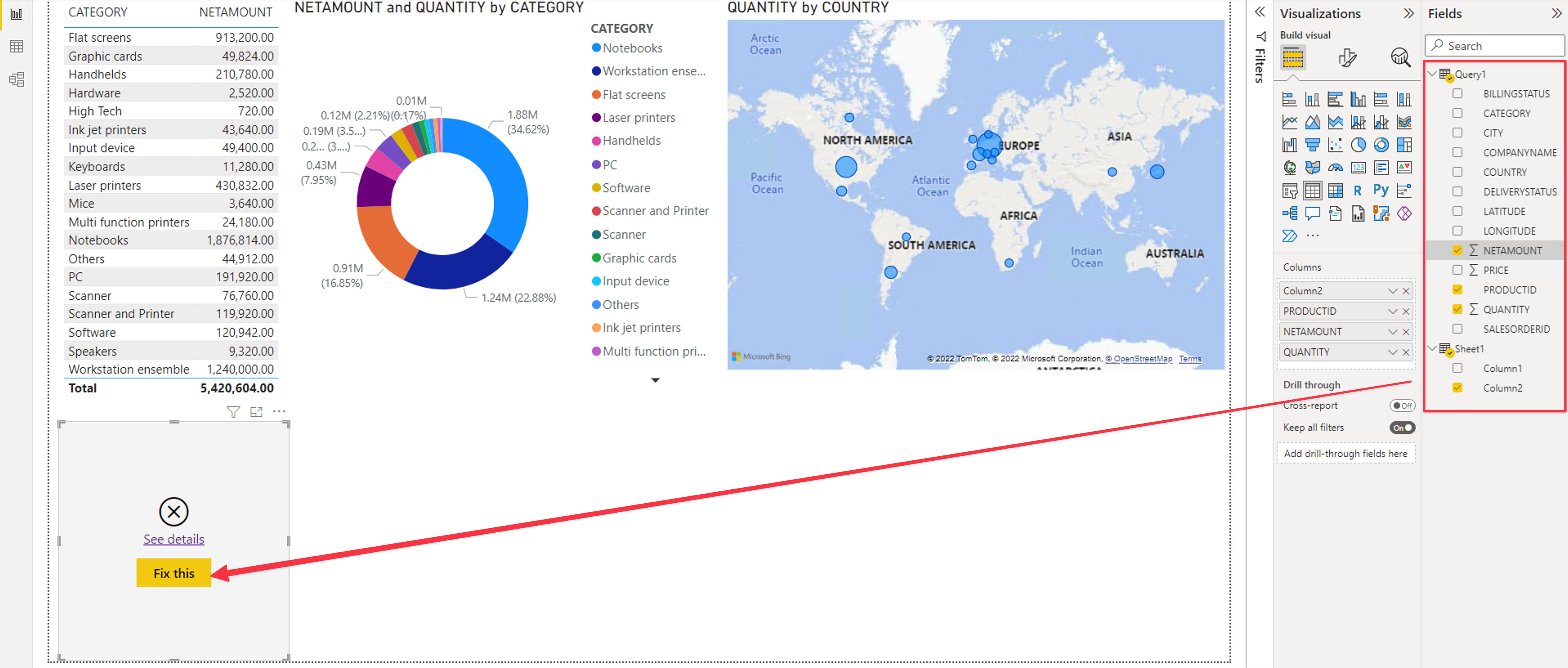
-
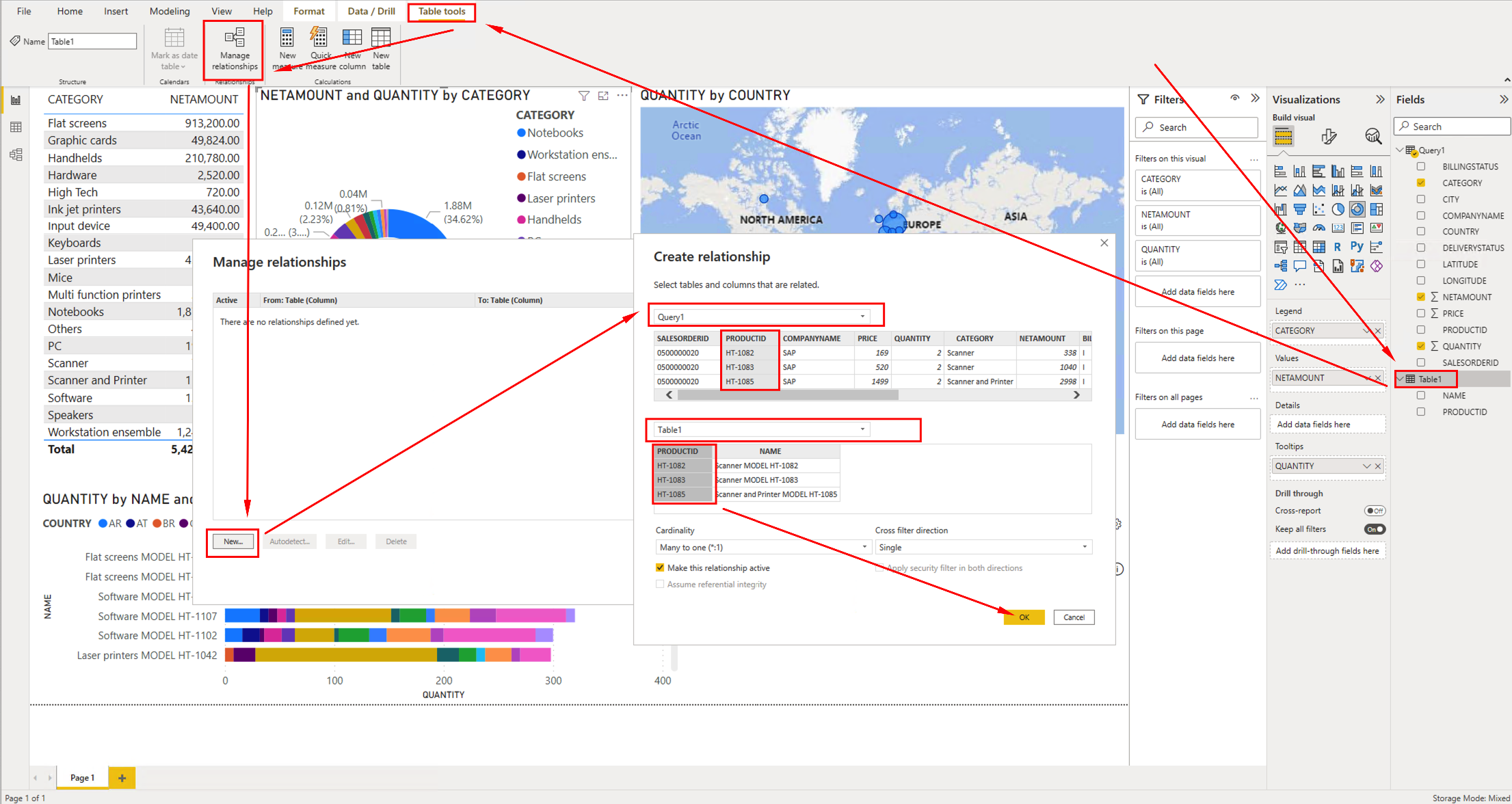
Click on Manage relationships, then on New and pick the Query1 and Table1 and the PRODUCTID field for both. Now Power BI knows how to join those two queries.
-
On the Visualizations Pane, click the Stacked horizontal bar. Drag the fields on the right side to the Visualization parameters as in the picture below:
- Y-axir = NAME (from Table1)
- X-axis = QUANTITY (from Query1)
- Legend = COUNTRY (from Query1)
-
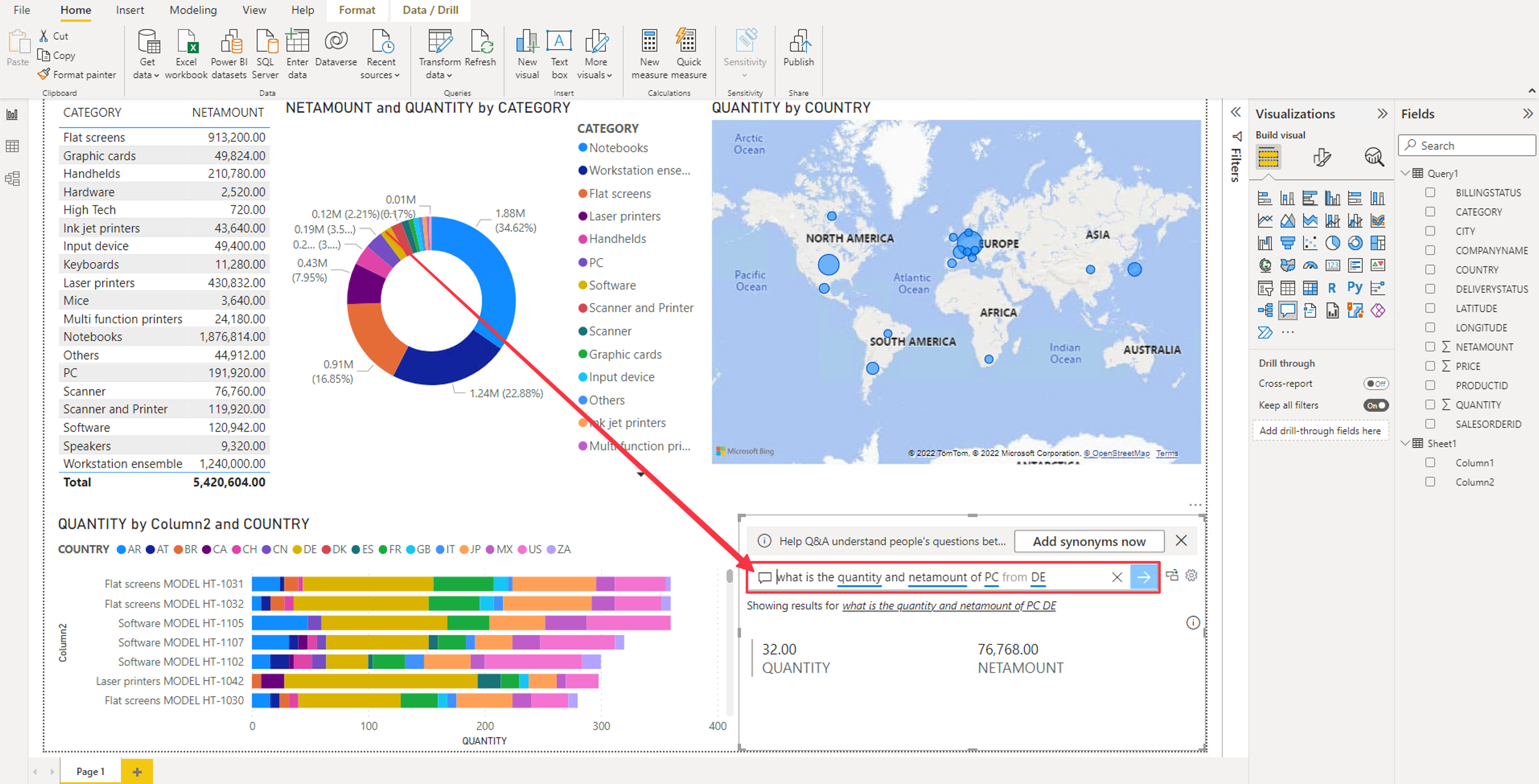
Finally let’s add a Q&A for custom questions in natural language. Click on the Q&A visualization and drag it to the report. Click on Turn on Q&A.
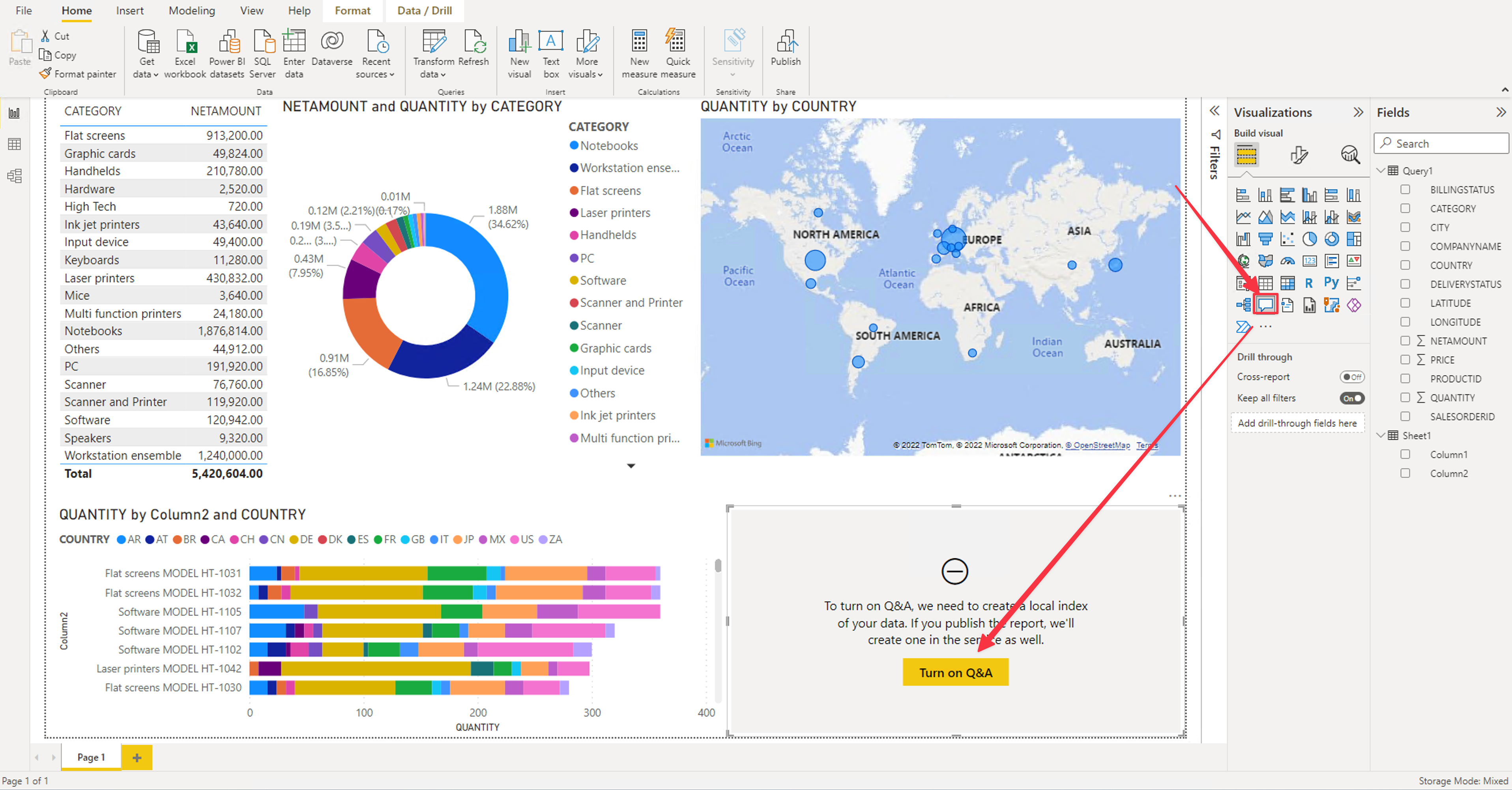
-
Test the Q&A using nautral language: What is the Quantity and netamount of PC from DE
Conghratulations! We just build the first report using SAP HANA data! Feel free to explore the data and the drill-down capabilities of the integrated visualizations like in the video below: