From HANA Objects
In this step we will read data from SAP HANA published objects from the SHINE package imported on the #1.
The steps required are:
Datasource setup
- Open Power BI desktop, open a new Report.
- Click on the Get Data and select More
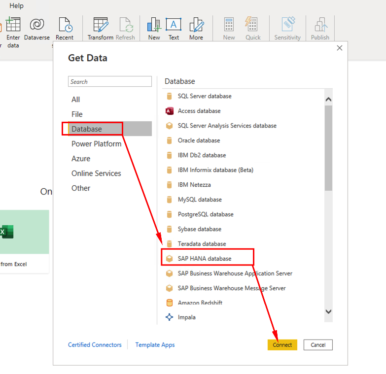
- Select Database and pick SAP HANA database. Click Connect
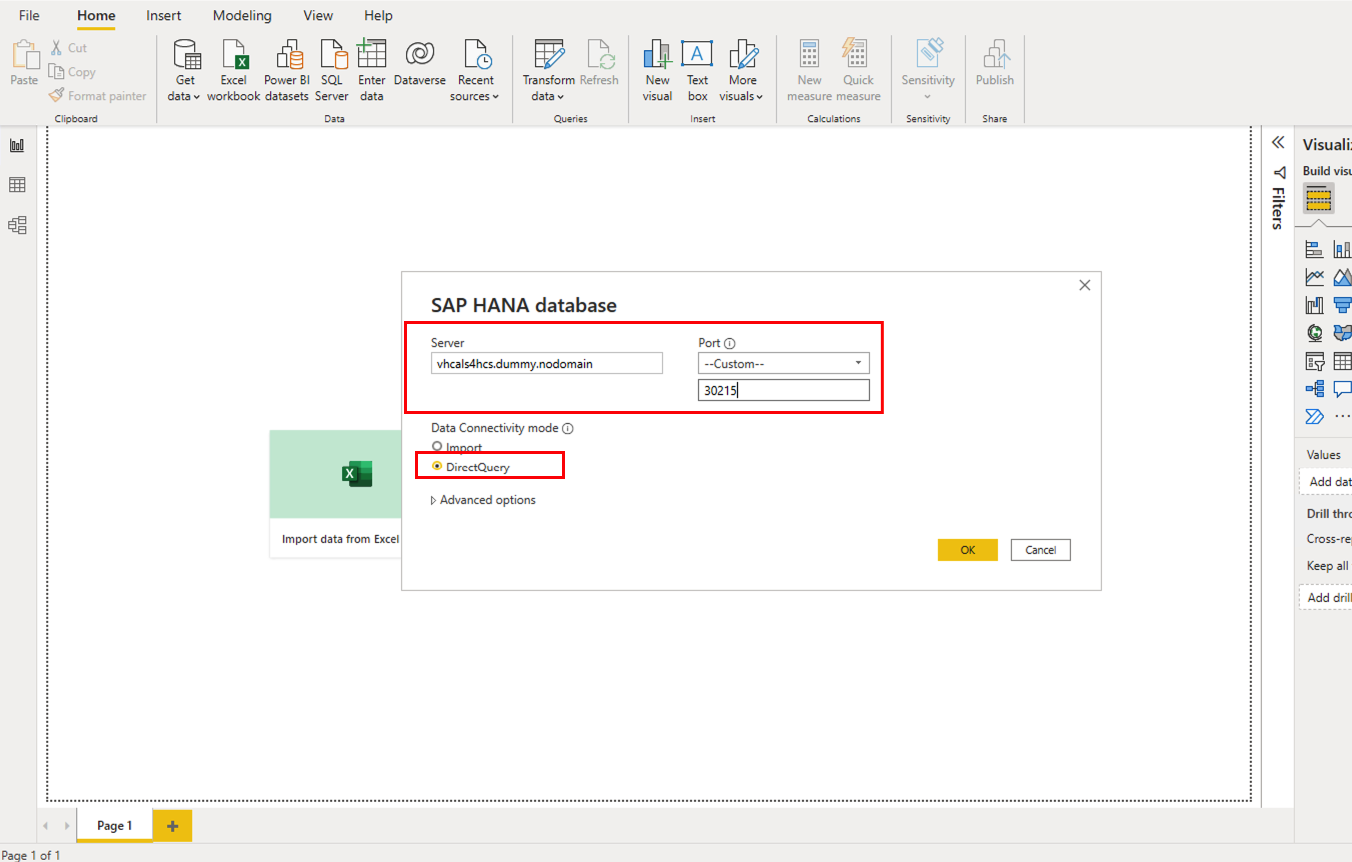
- On the connection parameters set:
- Server = vhcals4hcs.dummy.nodomain
- Port = Custom and 30215
- Data connectivity = DirectQuery
- Click OK
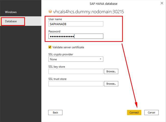
- On the SAP HANA credentials set, click on the Database on the left panel and set:
- Username = SAPHANADB
- Password = The one set during SAP CAL deployment
- Uncheck Validate Server Certificate
- Click Connect
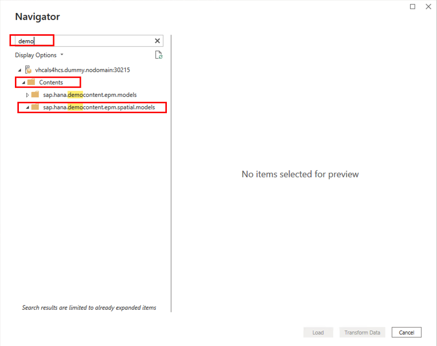
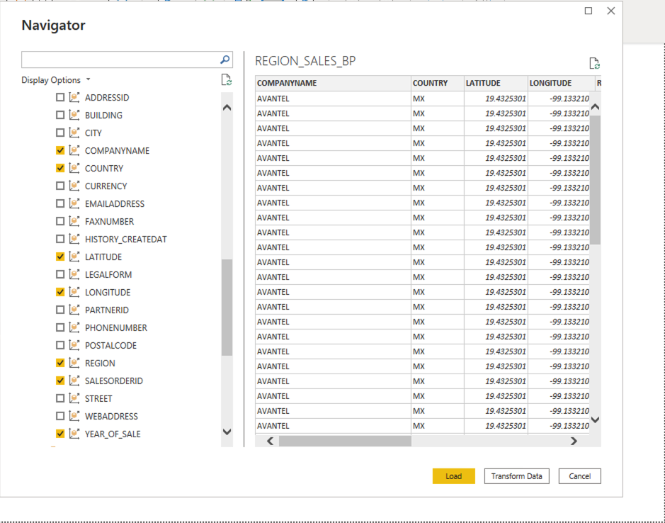
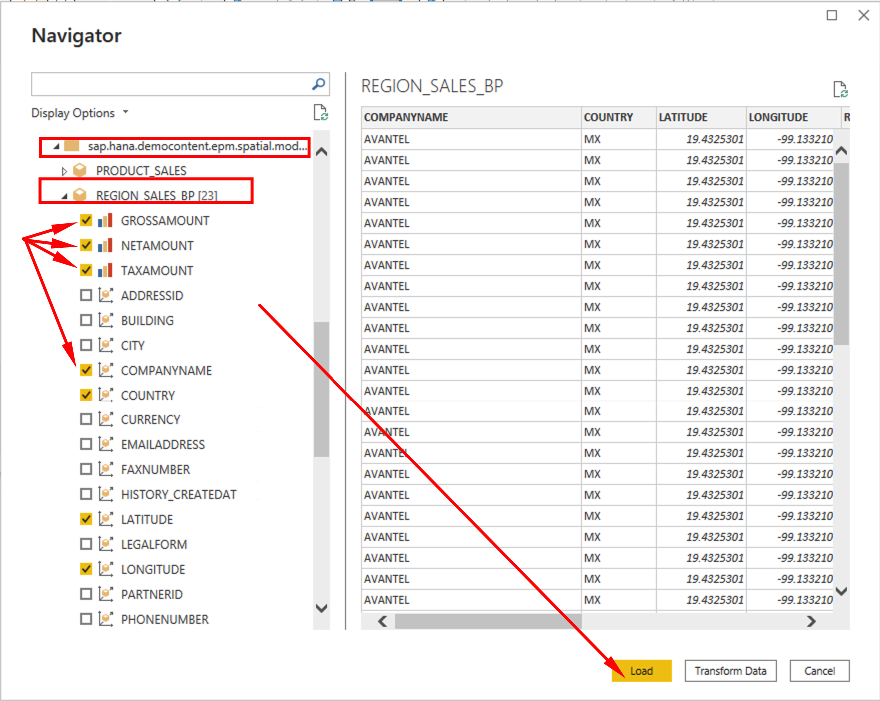
- We are ready to select the datasource. On the Navigation window, feel free to explore the published objects. For the lab we will use an specific datasource from the SHINE package loaded. filter using demo and pick sap.hana.democontent.epm.spatial.models
- Open REGION_SALES_BP and select the following fields:
- GROSSAMOUNT
- NETAMOUNT
- TAXAMOUNT
- COMPANYNAME
- COUNTRY
- LATITUDE
- LONGITUDE
- REGION
- SALESORDERID
- YEAR_OF_SALE
- Check sample data and Click Load
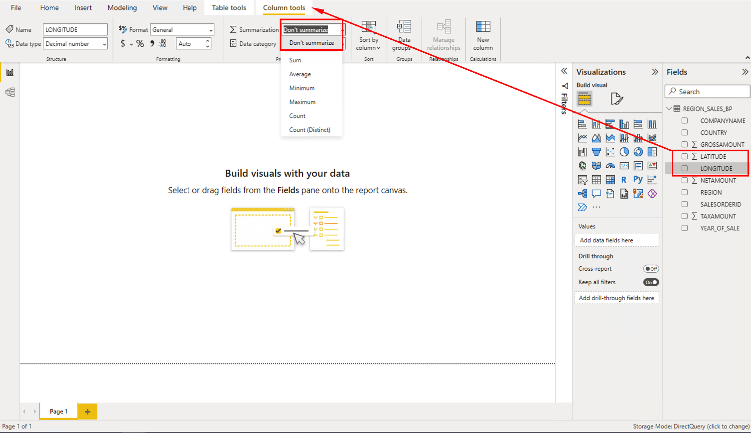
- Before we start, let’s remove summarizations from LATITUDE and LONGITUDE fields. For both fields:
- Click on the field on the right panel
- Go to Column tools
- On Summarization pick Don’t Summarize
Now we are ready to start building the visualizations !
Building the visualizations
Let’s create some charts:
-
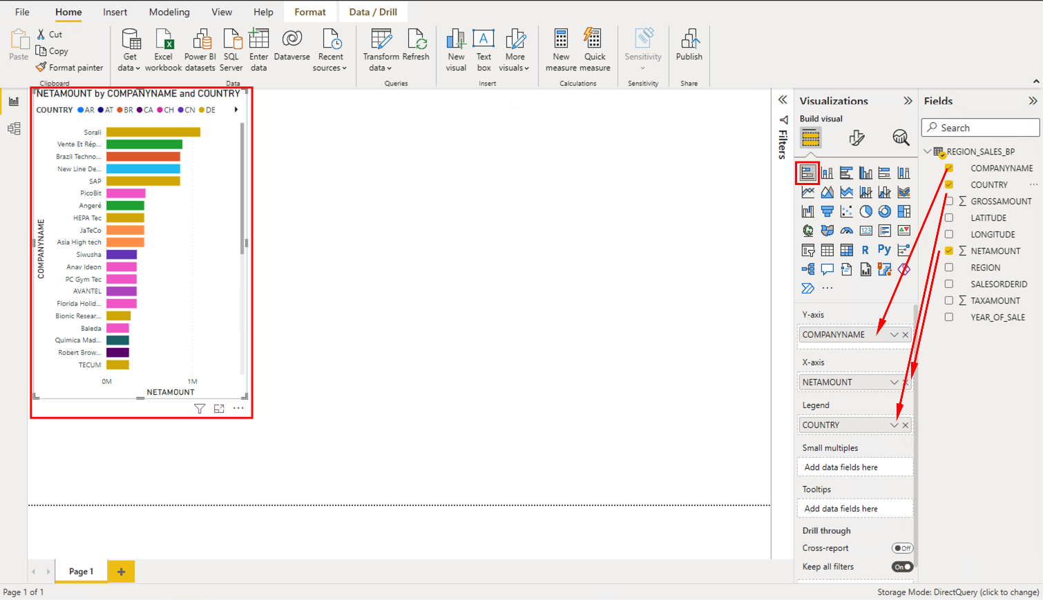
On the Visualizations Pane, click the Horizontal Bar. Drag the fields on the right side to the Visualization parameters as in the picture below:
- Y-axis = COMPANYNAME
- X-axis = NETAMOUNT
- Legend = COUNTRY
-
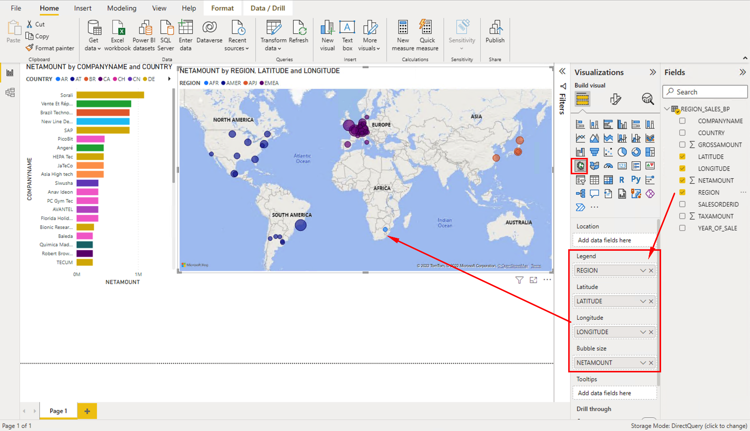
On the Visualizations Pane, click the Map. Drag the fields on the right side to the Visualization parameters as in the picture below:
- Legend = REGION
- Latitude = LATITUDE
- Longitude = LONGITUDE
- Bubble Size = NETAMOUNT
-
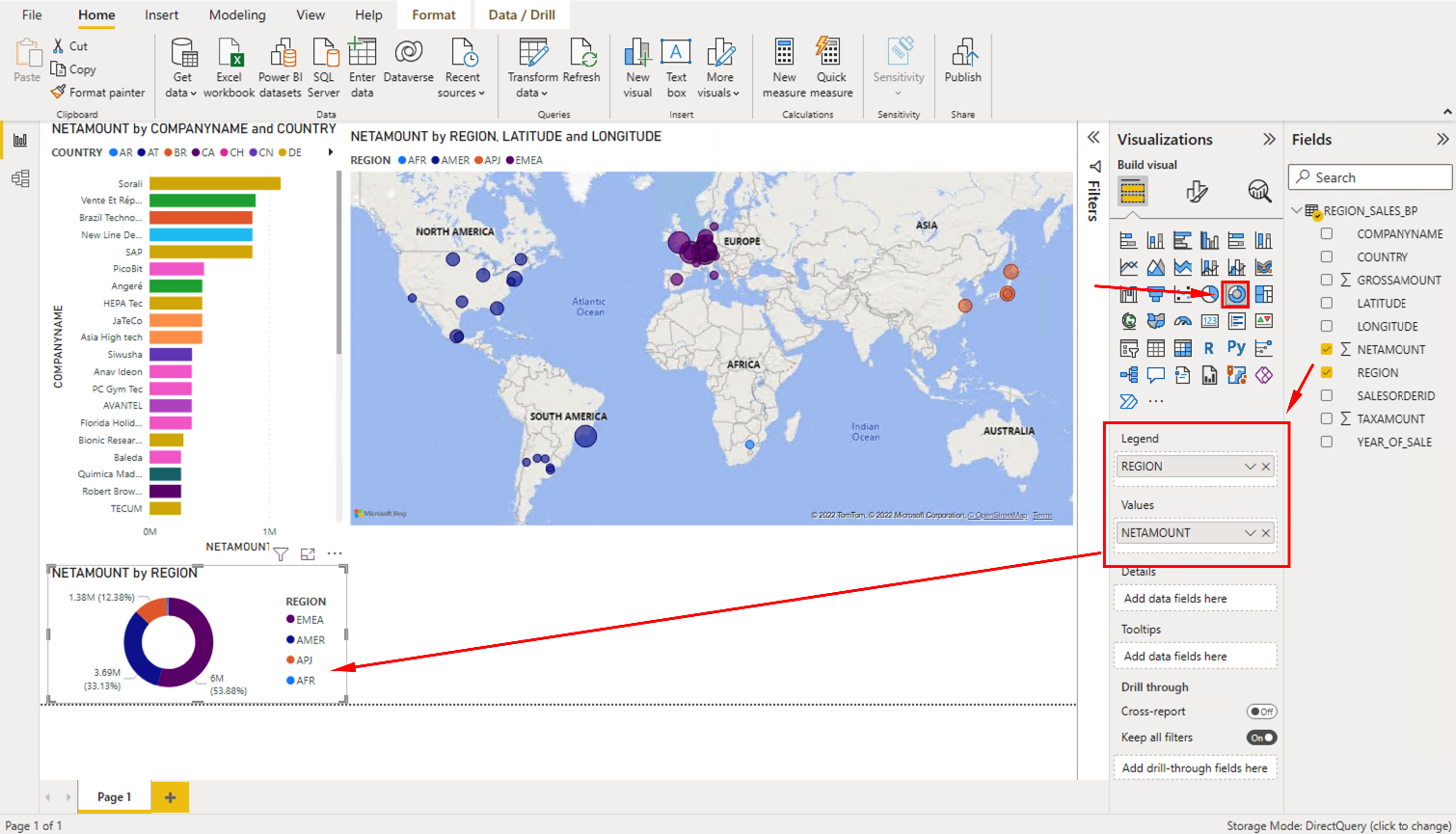
On the Visualizations Pane, click the Pie Chart. Drag the fields on the right side to the Visualization parameters as in the picture below:
- Values = NETAMOUNT
- Legend = REGION
-
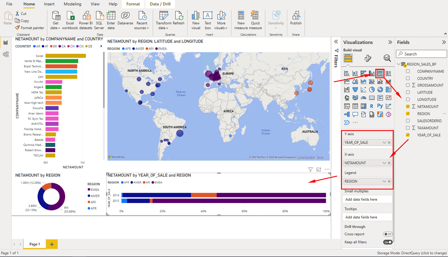
On the Visualizations Pane, click the Stacked Horizontal Bars. Drag the fields on the right side to the Visualization parameters as in the picture below:
- Y-axis = YEAR_OF_SALE
- X-axis = NETAMOUNT
- Legend = REGION
Conghratulations! We just build the first report using SAP HANA data! Feel free to explore the data and the drill-down capabilities of the integrated visualizations like in the video below:
On the next section we will do something similar, but now using a custom query and and Excel file as external data.